Valencia-based architects and interior designers, Masquespacio, have designed the Doctor Manzana project. Completed in 2013, the project involved the redesign of Doctor Manzana’s branding and store design of their retail outlet located in Valencia, Spain.
Doctor Manzana is a brand that specialises in technical support for smartphones and tablets, and also sells gadgets for mobile devices.

Due to the company seeing great success online the brand decided to open their first store in Spain. And Masquespacio redesigned the graphic identity of the brand with the purpose to strengthen the brand and apply it to store.

According to the designers: “The logotype starts from the principal axe of the company ‘the touchscreen’ and his reflection that creates an angle of 54 degrees. That angle ends being part of the whole communication and his defragmented into different applications that create an infinity of forms able for the graphic and interior design”

Ana Milena Hernández Palacios, creative director of Masquespacio, said: “Talking about the colours as we started from a company name allied with a doctor we wanted to create a concept based on a hospital, however as we didn’t want to create a conventional design, we discarded this option, but maintaining blue and green colors as a reference to the first word in the company’s brand name.”

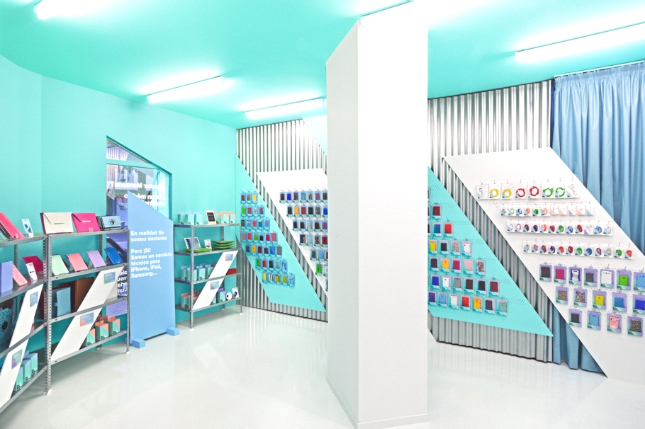
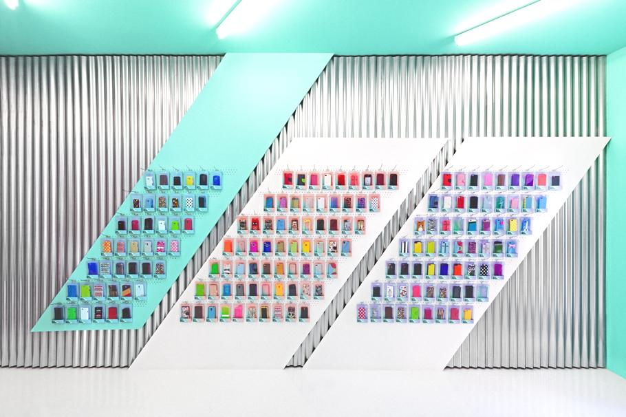
Looking at the store design everything starts from the striking façade that incorporates the same angles and colours just like the graphic identity. The blue and green colours is a reference to the doctor, the salmon for fashionistas and purple for the rebels. Both windows contain texts like “Doctor Manzana? Is it an orthopedic doctor? No! It’s a team of technicians specialised in cracks, breaks and accidents for smartphones and tablets,” communicating Doctor Manzana’s services in a comical way.
“On arrival to the store you can see how the interior design from the graphic design contains loud and bright colours and a bunch of angles appearing continually in their original form or defragmented, making reference to the reflection of the touchscreen. A technological air blows through the store, while some details like the blue curtain refer in a metaphorical way to a hospital. Materials like the galvanised steel sheets are doing their more industrial work in the space, while white furniture is offering a light warm touch to the whole. Meanwhile, the different pastel colours bring the diversion part of Doctor Manzana’s identity to the space.”


Images courtesy of David Rodríguez